Color harmony and contrast use color to build visual hierarchy
When you take a photo, you're not just capturing objects — you're organizing visual weight. One of the most powerful tools for shaping that structure is color.
Color tells us what to look at first. It creates hierarchy, emotion, and movement. When you understand how to use both harmonious and contrasting colors, you gain control over the way your photo feels — and the way it’s read.
This blog focuses on how color can be used to build structure, not just style — especially in smartphone compositions where color relationships are often the first thing the viewer notices.
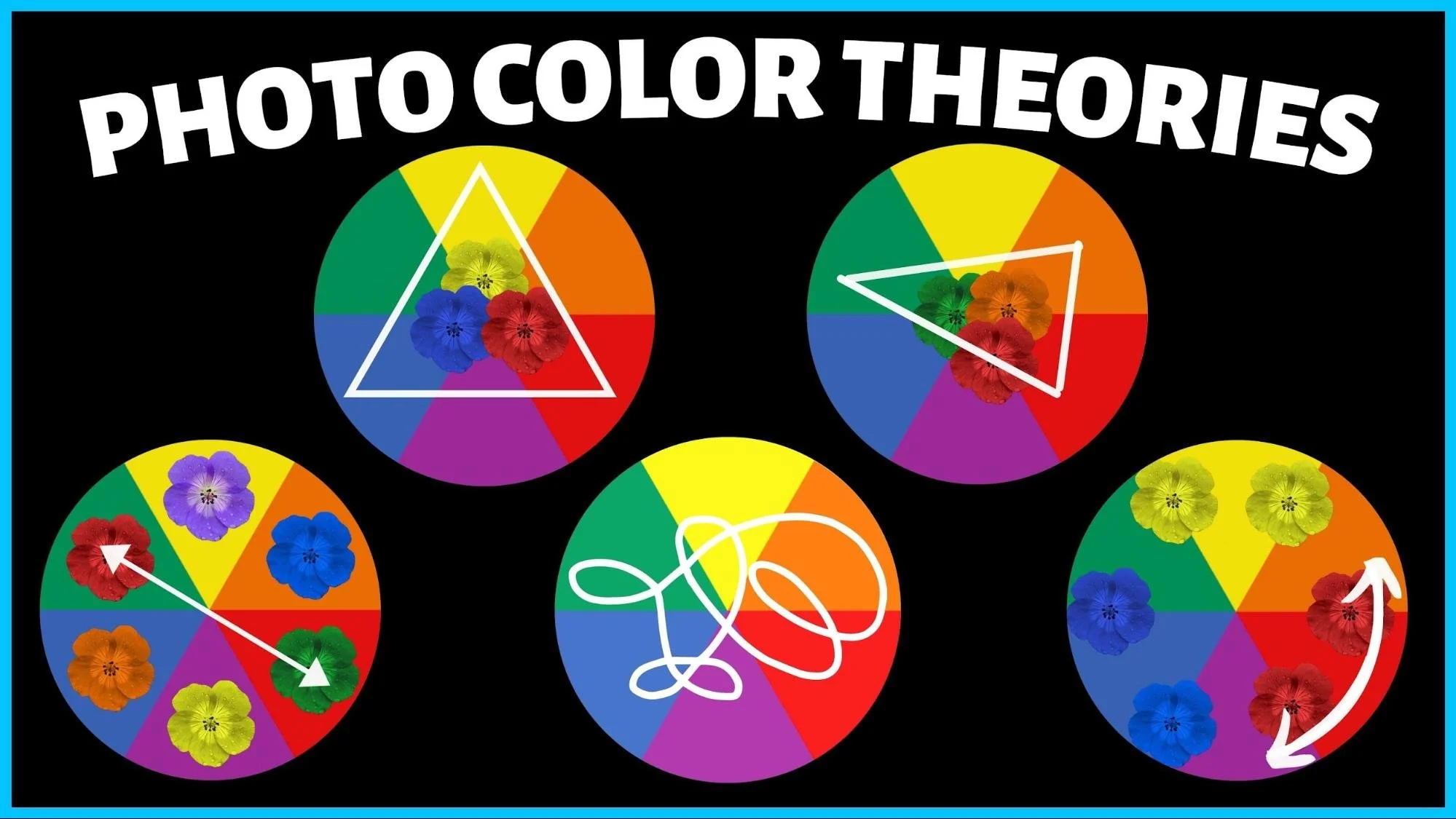
What is color harmony?
Color harmony refers to combinations of colors that sit close to each other on the color wheel — such as:
Blue, teal, and green
Red, orange, and brown
Cream, beige, and soft pink

These combinations are pleasing because they feel natural, cohesive, and unified. They calm the eye and allow the viewer to focus more on content and form.
In photography, harmonious colors are useful for:
Creating a cohesive mood
Supporting the subject rather than distracting from it
Establishing a calm or elegant tone
What is color contrast?
Color contrast uses colors that are opposite or far apart on the color wheel — such as:
Red and green
Blue and orange
Yellow and purple
Black and white (tonal contrast)
These pairings create visual tension and energy. They draw the eye and highlight the differences between elements.
In photography, color contrast is useful for:
Creating focal points
Separating subject from background
Guiding the eye through the frame
Adding intensity or emotional pop
Why these strategies matter
They build visual hierarchy: You can control what’s seen first, second, or last
They simplify or energize: Harmony brings calm, contrast brings excitement
They support your story: Color choices reinforce emotion, time, and setting
They improve readability: Especially in busy scenes, color contrast adds clarity
This is how color becomes more than just a mood — it becomes structure.
How to use color harmony with your smartphone
Use a consistent palette
Choose wardrobe, props, or backgrounds in similar hues. This creates visual cohesion.Find naturally harmonious scenes
Landscapes, interiors, and urban textures often contain related tones.Edit with subtle adjustments
Apps like Lightroom let you shift hues slightly to create a tighter color feel.Let shape and light take over
With harmonious colors, other compositional elements like form and contrast shine more.
How to use color contrast for hierarchy
Use complementary colors intentionally
Place a subject in one color (e.g. red) against a contrasting background (e.g. green) to make it pop.Highlight the focal point
Choose contrast for only one element — everything else should support it tonally.Use contrast to lead the eye
Place bold colors where you want attention to go first.Let saturation vary
Highly saturated colors attract attention; muted tones recede. Use this to control flow.
When to use harmony vs. contrast
Harmony: For portraits, fine art, soft storytelling, and when emotion or texture is key
Contrast: For street photography, editorial work, dynamic subjects, or when structure matters most
Sometimes the best compositions use both — harmonious background, with one strong contrasting focal point.

Did you know?
Painters and designers have used color theory for centuries. Artists like Claude Monet used harmonious palettes to build mood, while graphic designers use contrast to direct attention instantly. In advertising, a bright call-to-action button often uses color contrast to stand out — it’s the same principle in photography: use color to guide and prioritize.
Tips for better color use
Use the color wheel as a guide when composing or editing
Think in color zones: foreground, subject, background — each should play a role
Desaturate distractions: Use editing tools to mute unnecessary color clutter
Shoot in soft light: Color relationships are easier to control without harsh light interference
Common mistakes
Using too many bold colors — resulting in chaos
Letting the background compete in color with the subject
Over-saturating in post-processing — making the image feel unnatural
Ignoring color direction — leading the eye nowhere
Color is powerful — but only when used with intent.
Related techniques
Use the search bar above to search for any composition technique, including the below:
Figure to ground
Isolation
Negative space
Emphasis and dominance
Visual hierarchy
Conclusion
Color harmony calms. Color contrast directs. Together, they give you full control over how your photo is seen — and how it feels. Whether you want balance or intensity, mood or message, learning to compose with color intentionally transforms your smartphone images from visual noise into clear visual storytelling.
📘 Want to use color like a designer, even when shooting on your phone? Stronger Photo Composition - 4-Step System gives you a complete framework for mastering color, structure, and impact.
👉 Buy the physical book or PDF version of Stronger Photo Composition - 4-Step System